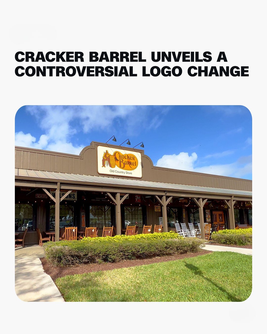
The American roadside favorite Cracker Barrel is in hot water after revealing a controversial new logo that has many longtime fans upset. For over 40 years, the brand was identified by a barrel and a man sitting beside it, but the new design removes these elements.
The rebrand is part of a $700 million modernization plan that includes revamped menus and updated restaurant interiors, aiming to attract younger diners.
Despite claiming the new logo remains inspired by the barrel shape, critics say removing the barrel itself breaks a key link to the chain’s heritage and identity.
Investors reacted negatively, with the company’s shares falling over 12% after news of the redesign.
CEO Julie Felss Masino explained the need to update the brand to remain relevant in a competitive industry and pointed to research supporting the changes.
New restaurant designs feature a cleaner, more modern look, replacing many of the country-style trinkets.
Some customers appreciate the fresh look, but many expressed their disappointment online, with TikTok videos lamenting what they feel is the loss of Cracker Barrel’s unique charm.
Discussion on social media has been heated, with some public figures criticizing the rebrand.
Marketing experts warn the company must navigate carefully as altering beloved logos risks alienating loyal customers.
Despite challenges, Masino says customer feedback has been mostly positive and hopes to reach a broader audience.
Cracker Barrel also reported a loss due to trade tariffs but kept same-store sales steady.
The balance between tradition and modernization poses a big challenge for the chain’s future success.